Walden.The House That Was Hiding a Better Version of Itself.
Wheelers Hill, Victoria. A renovation that started with the stairs and ended with a family who finally had room to live properly.
Scope: Ground floor reconfiguration · Reverse Kitchen and living upgrade · Staircase relocation & Extension
Delivered: November 2024
On this page:
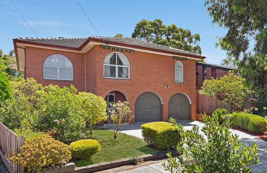
The House That Was Hiding a Better Version of Itself. Wheelers Hill
Wheelers Hill, Victoria. A renovation that started with the stairs and ended with a family who finally had room to live properly.
3 decisions that shaped this project:
- Extend small, in the right place. Most of the space the family needed was already inside the house. A small front extension let us move the stairs out of the centre of the plan.
- Drop the front balcony. A curved canopy gave the entry the same presence for far less.
- Spend the saving where it’s felt daily. A single garage door that finally made the garage usable.
The Brief
Paul and Sonya came to ArchIdea with a prepared Brief document.
It had floor plans, annotations, a rendered front elevation in dark grey with black trim, and a numbered list of work. That level of detail had a reason. They’d already been through a design process with another architect and came away feeling the building itself hadn’t been understood. The previous proposal included a spiral staircase, which was not acceptable for them.
So, they started working out their own solutions because no one had yet looked closely at what the house was actually doing.
Their goals were clear. The front of the house felt unbalanced. Two teenage daughters were sharing bedrooms. They wanted to go all electric, with an induction cooktop, reverse cycle heating and more solar. They wanted a modern, contemporary look that sat comfortably beside their neighbours, nothing imposing, and they wanted to keep the roof eaves.
Their assumption was that the house needed to grow.
Our first question was whether it did.
We suggested a site visit before responding to any of it.
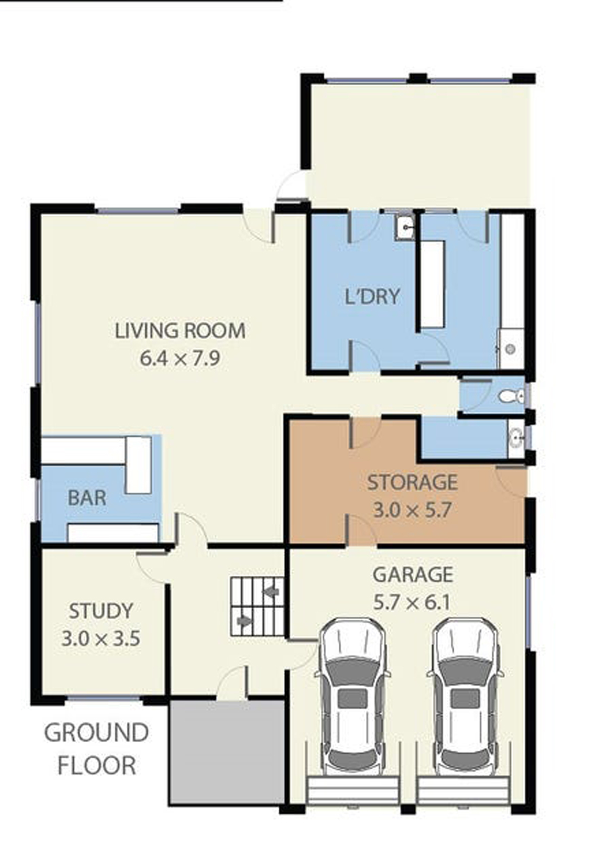
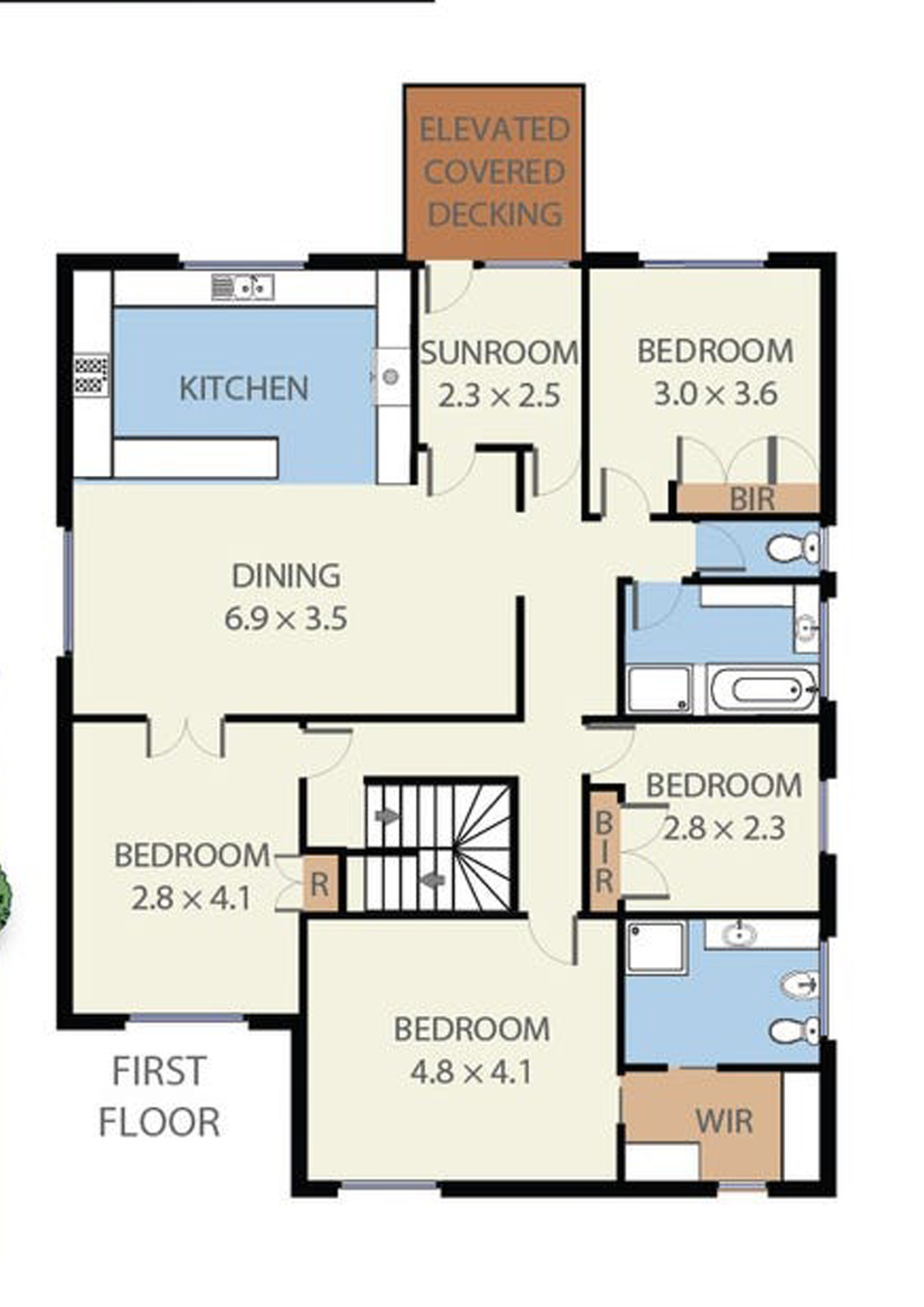
What we found
On that first visit we were in the walls, tapping to find what was structural and counting bricks before we drew a single line.
Paul and Sonya told us later that was the moment they knew we understood building, not just design, which was exactly what they’d felt was missing.
What we found changed the brief. The ground floor had a bar and entertainment area the family never used. Built into the side of the hill, it felt dark and closed off, so it sat empty while two teenage girls shared bedrooms upstairs.
That was the real brief. Not the kitchen. The house had the space the family needed. It was just being used for the wrong thing.
The family didn’t need a lot more building.
They needed what was already there to work differently, plus one small extension in the right place.
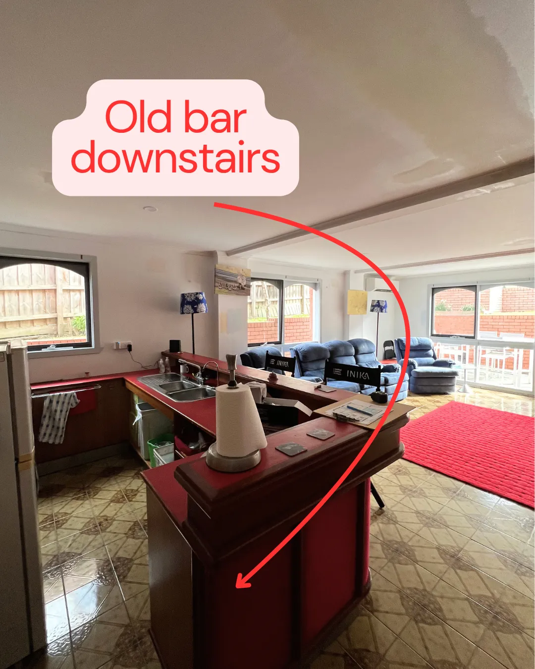
The original ground floor bar and living area: enclosed, dark and unused.
The Design We Let Go
We began with Concept Design and Estimation: working the whole scope through with Paul and Sonya and putting a cost against it before anything was committed.
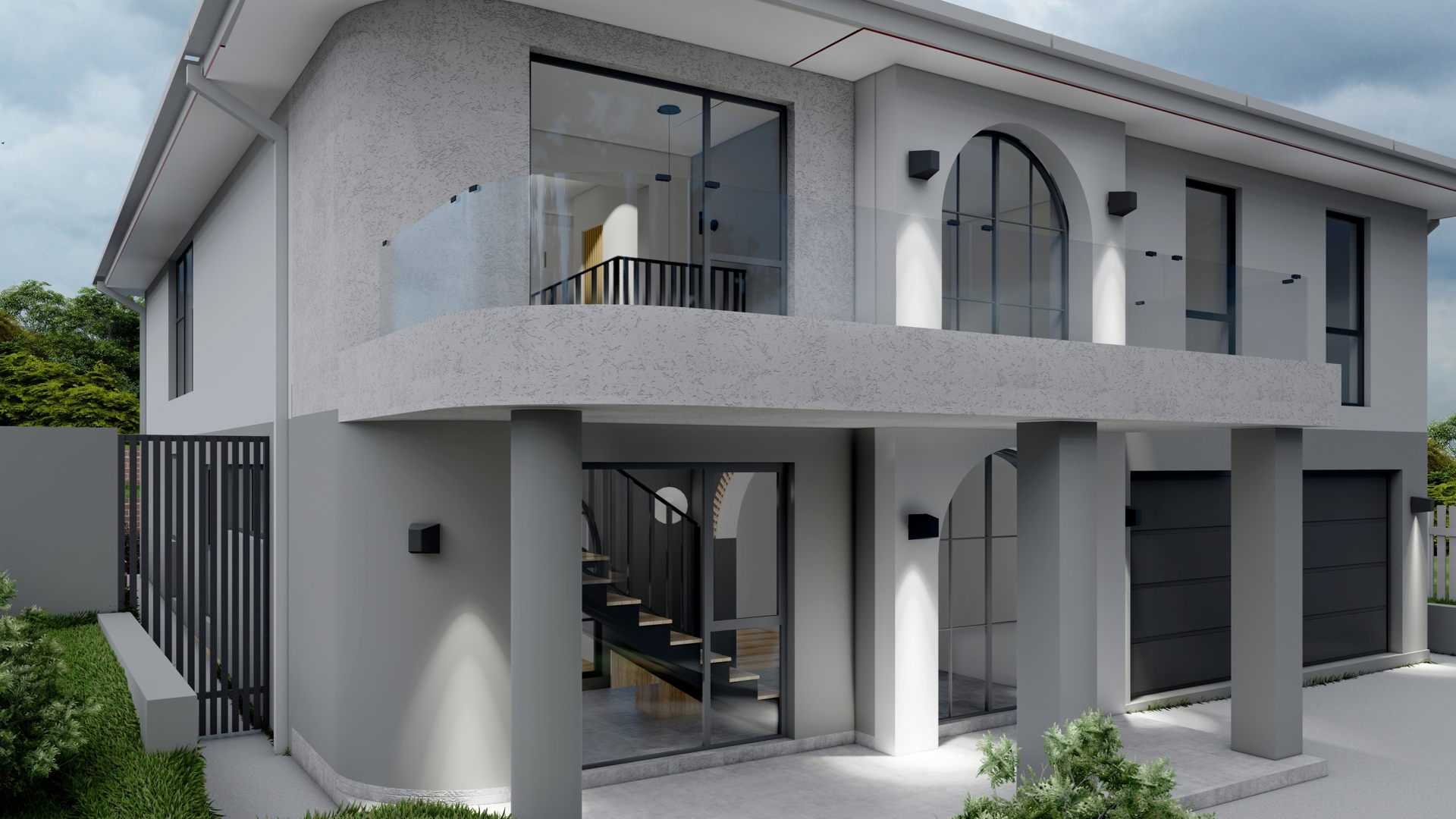
The first concept included a balcony over the front porch and the master bedroom’s arched window converted to a door. Both looked right on paper. The costing showed what they would take from everything else.
Paul said of that stage:
“It was the best thing we ever did.”
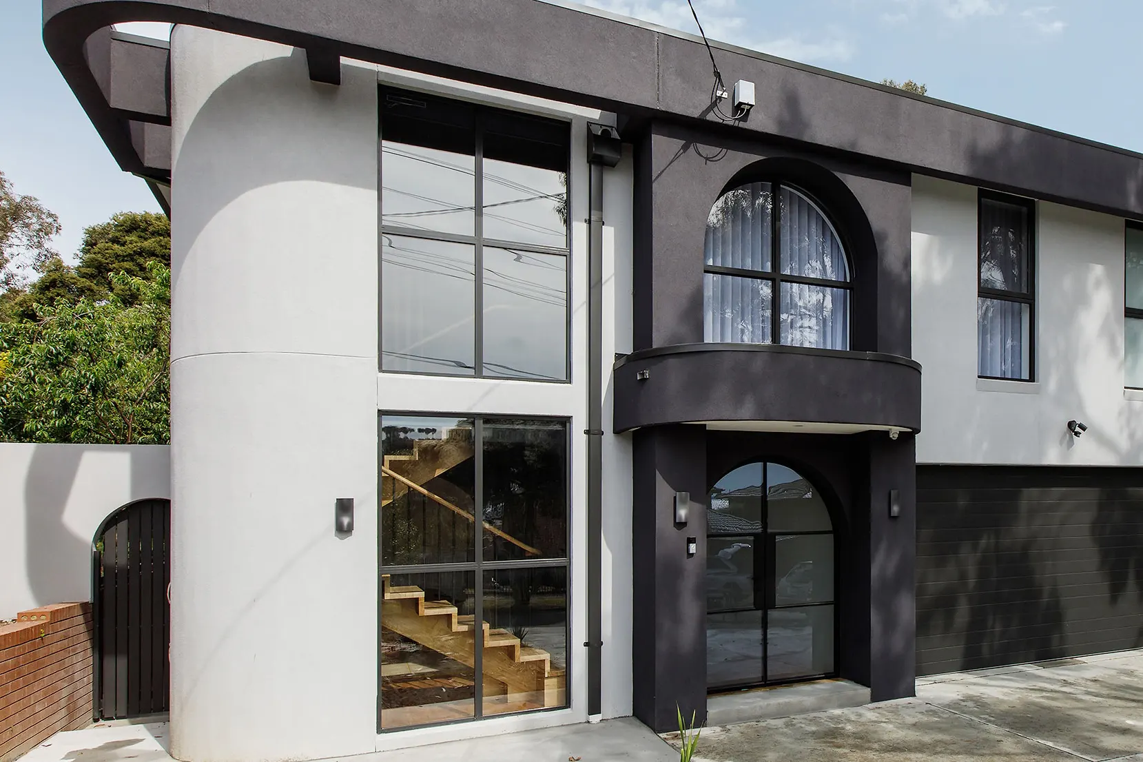
Then came the decision. The front balcony came off, and a curved canopy went in its place. It’s cleaner, it repeats the arch, and it costs far less. The saving went into a single garage door, which finally made the garage usable.
Good design here wasn’t adding the balcony. It was knowing which decision to pay for.
What the costing stage looks like
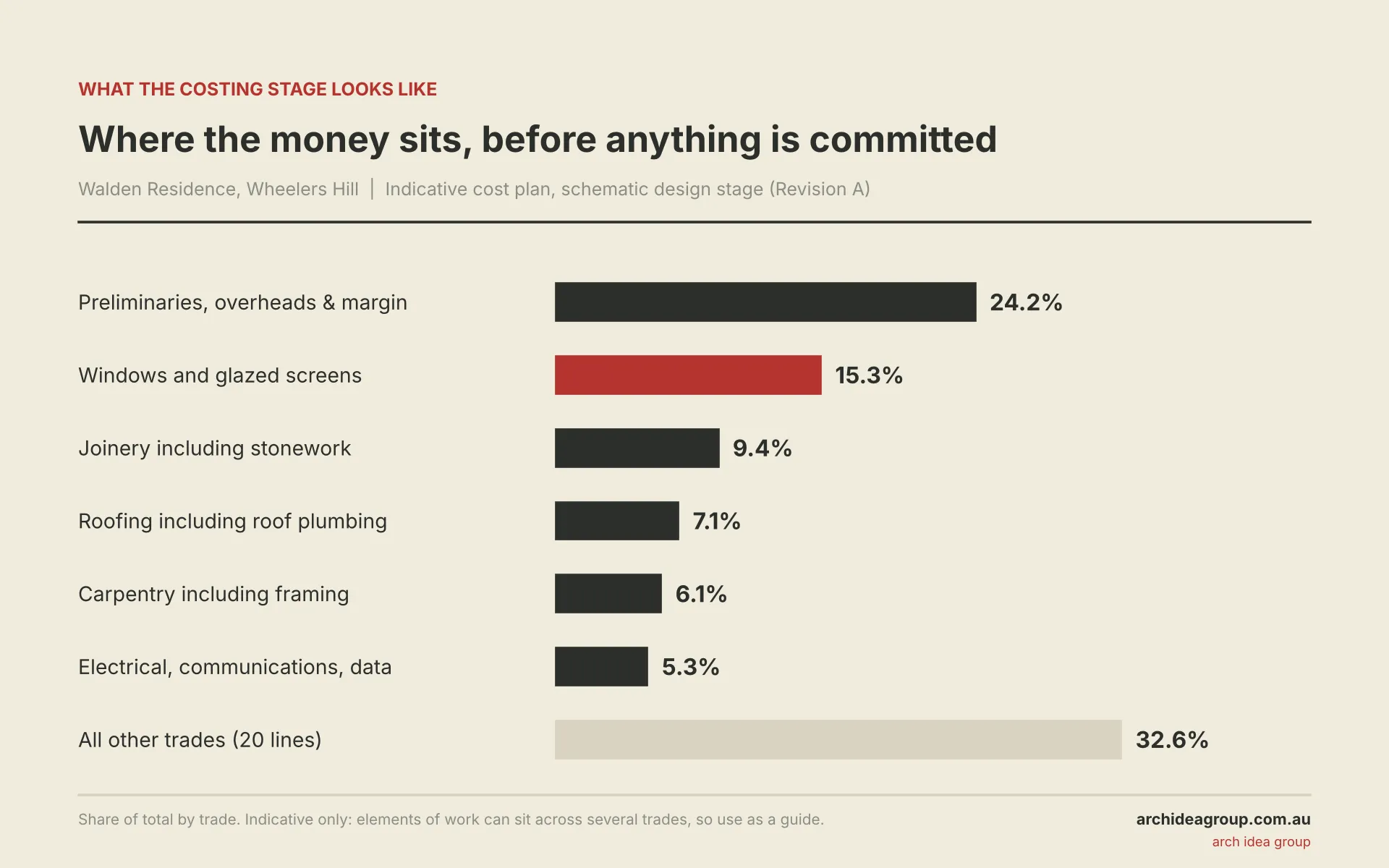
Before anything is committed, we put the whole scope into a cost plan that breaks it into trades. This is Walden’s first version, at schematic design stage. It’s indicative only, and it predates the value management that removed the front balcony and arched glass dooe was replaced with the window on the First Floor. Seeing where the money sits is what made that decision easy.
The Architectural Decisions Behind the Redesign
Two Bedrooms Where the Bar Was
The unused bar and entertainment area became two proper bedrooms with built-in robes, alongside the retained study and laundry and a new bathroom. The girls got their own space and the parents got theirs.
Moving the Staircase
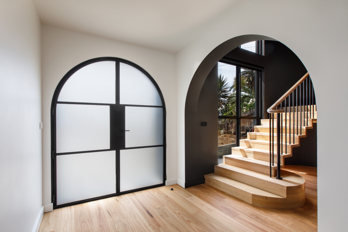
The original staircase had been badly placed – it ate into the floor plan and made the house awkward to move through. We relocated it. That single decision unlocked the spatial logic of the whole home and made the layout feel considered rather than accidental.

Opening the Kitchen and Living Area
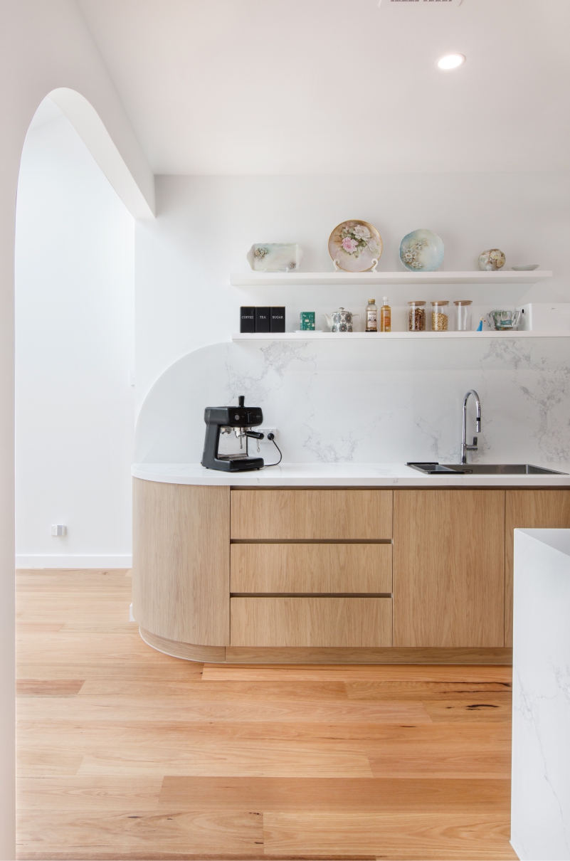
The kitchen and living area the family actually used every day got the upgrade the brief originally asked for — but now it worked with a house that had been properly reorganised, rather than being a patch on top of an unresolved plan.
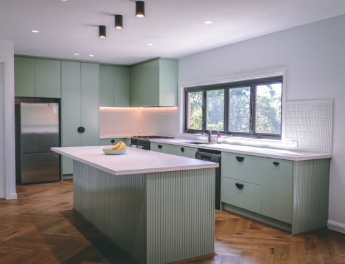
We raised the kitchen bench to a height that actually suited how the client cooks. Years of back strain from a bench that was too low, solved in a specification that cost nothing extra. The kind of detail that only comes from asking the right questions before picking finishes.
Keeping What Was Worth Keeping
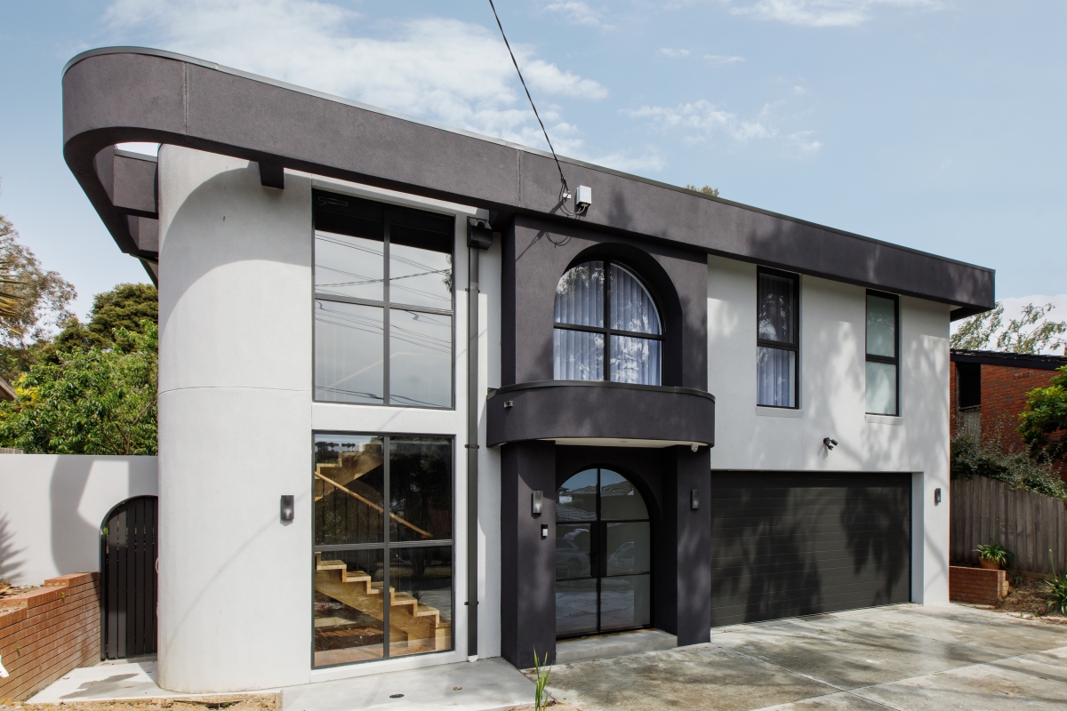
The original arched window was a feature worth holding onto. Rather than defaulting to the square windows in the first concept, we repeated the arch’s curve through the new work — in the openings, in the detailing, in the street elevation.
The result is a house with a street presence nothing else on the block has. The renovation reads as intentional, not as something that happened in stages.
What We Saved the Client
We knew which parts of the project needed a planning permit and which didn’t — because we’d been in the walls on day one and understood the building. That knowledge saved the client time and cost on approvals they didn’t need.
This is what site knowledge does. It isn’t just about understanding the building — it’s about understanding what’s possible without adding process, cost, and delay.
205
ALTERATION AREA m2
70
ADDITIONS AREA m2

“When we saw that staircase walls and even ceiling were proposed to paint black, we were shocked initially, but then I decided to go for it and I am glad we did it, because it looks great.
Sonya, Homeowner.

Our team aimed to create a harmonious blend of form and function, with a warm and inviting ambiance. The Walden Residence is a unique project that showcases our commitment to craftsmanship and attention to detail.

The Result
A home that had been hiding a better version of itself for years found it.
The girls have their own bedrooms and a separate living space. The parents have a kitchen and living area that works for how they actually live. The house moves properly. The street elevation has an identity. And the family didn’t need a bigger home — they needed a better one.

Front Facade
Thinking About What Your House Could Be?
Most renovation briefs start with a room. The right question is usually about the whole house — how it’s organised, what it’s missing, and what’s already there that isn’t being used.
ArchIdea works with homeowners across Melbourne’s south-eastern suburbs and the Mornington Peninsula to find what the house is hiding — before drawing a single line.
Project Details
Location: Somerville, Mornington Peninsula
Completed: Early 2025
Scope: Alfresco, pool courtyard, pergola, landscaping
Alfresco: 30m² covered, plastered, heated
Pool: 8.5m × 3.8m, pavilion finish surrounds
Budget: $250,000 ex-GST,including the pool build
Outcome: Enhanced property value, family entertainment space, compliant pool safety zone

“We think this all looks great. I love the LED strip lights under the over head cupboards and we like the battens in the opening (ties in nicely).”
Paul, Homeowner.